


VISUAL COMMUNICATION SERVICES
With simple means like typography, colors, photography, layout... we try to connect with people. To touch them. To make them think differently. To make them care about things they didn't think about before.
Visual identity is as important for any restaurant or bar as it is for any other brand. It improves the brand image and creates trust in customers. Visual identity could attract new customers, as well as keep the existing ones.
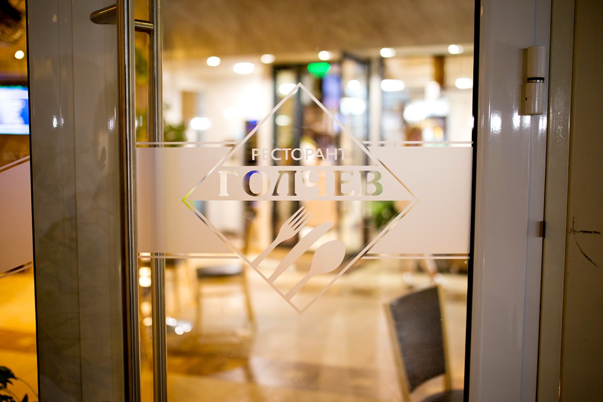
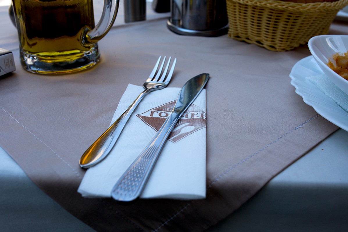
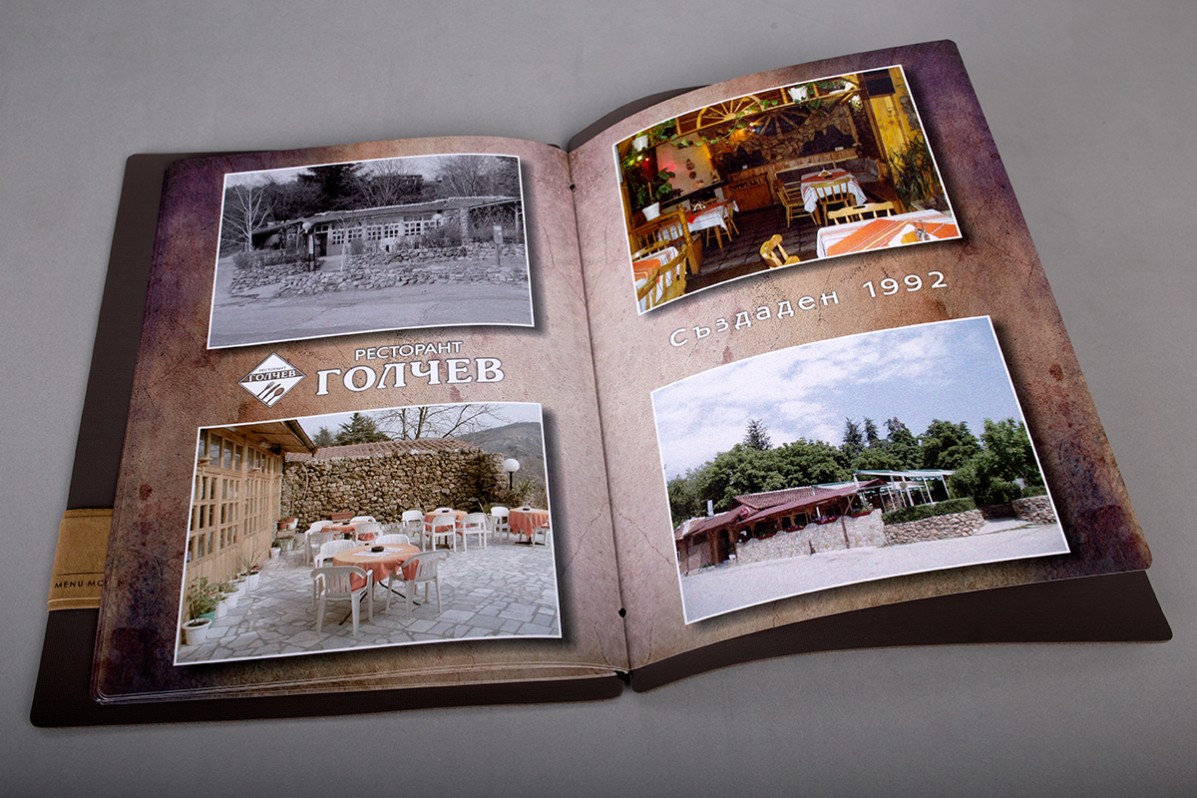
Visual communication in hotels is much more than brand and logo, but they are the most important for creating a successful brand. They have to show the culture and natural features of the hotel's location.
Pirin Park Hotel logo graphically implements a popular peak in Pirin Mountain, and below it is the healing mineral water of Sandanski.

The AquaSun Hotel and Spa logo symbolizes the sun in Sandanski - the sunniest city in Bulgaria, as well as the mineral water that is used in the hotel's spa center.

Small information signs are an integral part of our daily life. Along with stickers, they are one of the most accessible means of visual communication.
Visual communication in bars and restaurants is important for the user experience and improves the overall image of the place.

3D signs and glass decoration for the office of Happy House Real Estate.


Design and print of menus for the restaurant and the pool bar of AquaSun Hotel and Spa.


